Eurail
While planning my trip to the Christmas markets in Germany, I encountered several usability and accessibility issues on the Eurail website. I decided to conduct an initial expert review and an accessibility audit to identify the most basic problems. My focus was on fixing the fundamental design elements and ensuring the website met WCAG AA accessibility standards. This was a hobby project where I primarily aimed to improve the overall user experience without going into deeper levels of redesign. The two pages I worked on were the "Seat reservation" and "Train schedule" pages.
Page 1: Seat reservation page redesign
What worked well
Before I focused on improving the design, I identified a few good features:
- Logical and predictive flow: The user journey feels intuitive, with a natural progression through the search steps.
- Typing location: Location search works well, highlighting typed letters and offering suggestions even in the case of typos. It also provides helpful error messages when a location doesn’t exist and suggests possible alternatives.
- Multilingual support: The search results display location names in both the local language and English, such as "Cologne (Koeln)".
- Station interaction: Adding and removing stations is straightforward and intuitive.
- Traveler selection: The “Confirm” button gets disabled if there’s an error in traveler input, preventing submission mistakes.
- Date input behavior: If no date is entered, the last-used date automatically appears after the search.
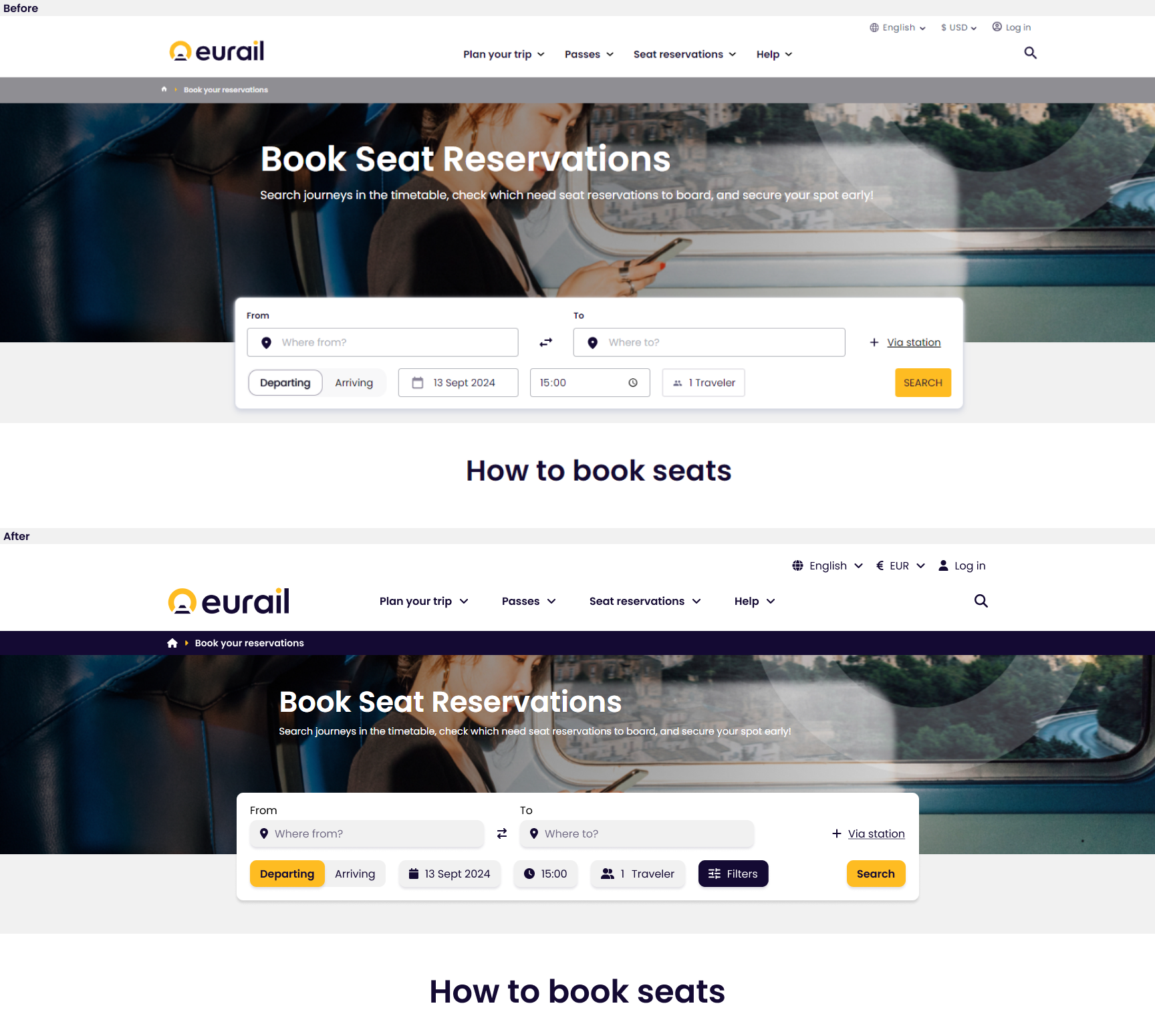
Areas for improvement
- Inconsistent icons: Some icons are solid while others are outlined, leading to a disconnected visual experience.
- Font sizes: The text uses 12px and 14px, which are not aligned with WCAG standards, potentially making it harder for users with visual impairments to read comfortably.
- Inconsistent box sizes: Input boxes/buttons vary in size (36px, 38px, 40px), creating a lack of uniformity.
- Button text: Most buttons use lowercase text, except for the search button, which is in all caps.
- Departure and arrival visibility: The departure and arrival points are not clearly distinguishable, making it hard to differentiate which one is selected. Additionally, they disappear after the search, making it difficult to track the chosen option.
- Date input behavior: The date field should allow only numerical input.
- Date clear button: The 'X' to clear the date doesn’t work, only the 'Clear' button does.
- Time selection: Time input uses two dropdowns (for hours and minutes), which is tedious. Scrolling through long lists for time (e.g., 23:50) is slow, and coordinating two dropdowns adds unnecessary complexity. A simpler, faster input method is needed.
- Traveler input alignment: The traveler number input is left-aligned, but centering it would provide a cleaner look. Only numbers should be allowed, no text.
Page 2: Train schedule page redesign
Key changes I made
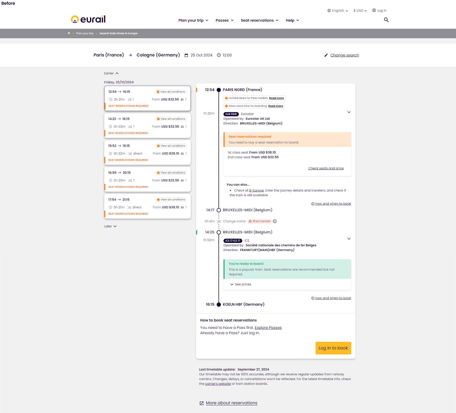
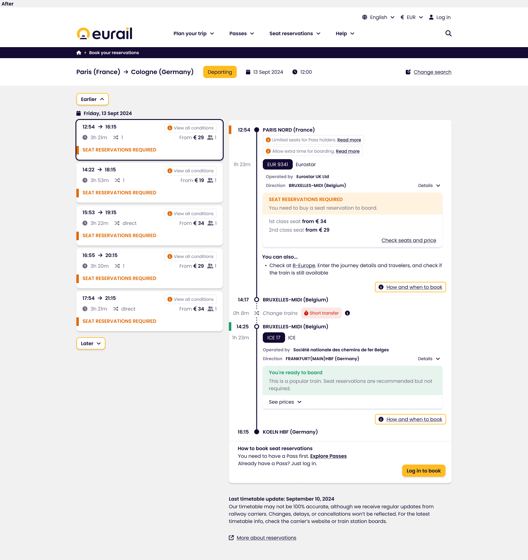
- Unified icon design: I made all icons solid to maintain consistency, as there were previously mixed styles (solid and outlined). The arrow icons had inconsistencies with the arrowhead shapes, which have now been standardized.
- Font size consistency: Previously, font sizes ranged from 10-14px, with an exception for location text, which was 16px. Now, all primary text is set to 16px for improved readability, and less important text has been reduced to 14px, aligning the design with accessibility (WCAG) standards.
- Color contrast improvement: Although the brand colors (green and orange) align with the Eurail brand, their contrast ratios did not meet the WCAG standard of 4.5:1. Most of them had a 2:1 ratio, which strains readability. The contrast has been adjusted to improve legibility and accessibility.
- Blue variations minimized: The design previously used too many shades of blue, which created unnecessary complexity. These have been minimized for a simpler, more cohesive design experience.
- Consistent date format: The date format has been standardized to avoid confusion, especially for international users. Instead of using both "13 Sept 2024" and "13/09/24," the format now includes month abbreviations (e.g., "13 Sept 2024") for clarity.
- Dominant date and earlier/later buttons: The "Earlier" and "Later" buttons are now more prominent, and the date field includes an icon and greater visual emphasis to make them stand out.
- Consistent alignment: All elements are now aligned consistently. Previously, the top bar, breadcrumbs, directions, and timetable had different starting points (ranging from 190px to 260px). Now, everything starts from the same alignment for a cleaner layout.
- Enhanced timetable selection indicator: A previously thin black line indicating the selected timetable was hard to notice. I made it more dominant for better visibility, ensuring users can clearly see which timetable is selected.
- Dynamic navigation: To optimize screen space, the top navigation and breadcrumbs could be made dynamic. As users scroll down, the navigation would disappear, allowing more focus on the content. When scrolling up, the navigation and breadcrumbs would reappear for easy access.
Conclusion
This personal project allowed me to improve Eurail’s user experience by redesigning the seat reservation and train schedule pages. By focusing on consistency, accessibility, and usability, I made the interface easier to use and visually cleaner. Through this process, I learned how small design changes can make a big impact on user experience, especially in travel-related services.
Explore my design and dive deeper into the identified issues on my Figma board.