CoSMiC-EYE
During my internship, my primary focus was redesigning the CoSMiC-EYE application, a satellite-based tool for monitoring critical infrastructure near pipelines. Users, including data analysts and clients, use this application to compare satellite images and detect changes near pipelines. As a UX/UI designer, I conducted extensive research, created high-fidelity prototypes, and followed a five-phase design process: Empathize, Define, Ideate, Prototype, and Test. This involved understanding user needs, adding features, removing unnecessary elements, and crafting a new interface to improve usability and functionality.
Empathizing
My research aimed to understand our customers' needs and enhance CoSMiC-EYE for a
smoother user experience. I started by delving into CoSMiC-EYE's strengths and
weaknesses through desk research and expert reviews. This helped me understand our
company's history and software concerns. I then had in-depth interviews with
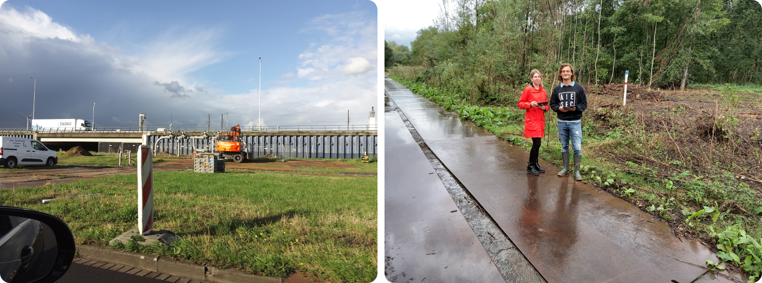
colleagues and long-time customers to uncover ways to improve the app. I even hit the
field, spending eight hours classifying 48 third-party interferences in the
Netherlands. This hands-on experience gave me insights into user challenges.
To sum it up, here were the key pain points I found in the first phase of the
project:
- The app often bombards users with unnecessary information.
- User locations and actions lack clear indications.
- Call-to-action buttons leave users pondering, seeking clarity.
- Notes and attachments demand richer timestamps, location data, and user insights.
- The process of adding a Monitored Event requires a user-friendly overhaul.
- Optical checking necessitates a simplified interface.
- Definitions must resonate with users through familiar language.
- The login process should be streamlined, eliminating unnecessary information.
- Pins must undergo a transformation for better threat level differentiation.
- The interface should evolve to be visually captivating, enhancing the overall user experience.
Analysing
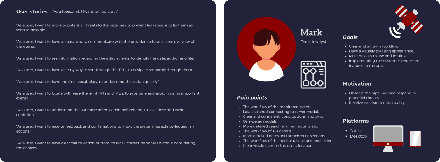
In the analysis phase, I examined research findings and observations through methods
like User stories, Persona, Sitemap, and Workflow. User stories highlighted pain
points and suggested solutions, defining personas' motivations and goals. During the
"Define" phase, I streamlined workflows to match user needs, optimizing pages and
features. I created a sitemap and a feature list for the new app, ensuring organized
progress.
Key changes included:
- Introducing new icons and pins for improved user clarity.
- Separating the filter and search bar to enhance usability.
- Creating distinct pages for account details and login, offering more functionality.
- Adapting new features based on user needs, including a downloadable list view and reporting missed events.
- Enhancing the optical checking page for a more intuitive experience.
- Enabling users to swiftly capture multiple photos while viewing relevant information.
- Crafting a streamlined interface for note-taking that automatically included essential details.
Prototyping
In the prototyping phase, I started visualizing my ideas by creating low-fidelity prototypes for the tablet version since it is the most used, and the space is limited. This was followed by testing and according to the results, I started creating high-fidelity prototypes. The processes went as follows: Low-fidelity -> Testing -> Improving -> High-fidelity -> Testing -> Improving, etc. A comparison of the old and new versions of the CoSMiC-EYE application with an explanation of the functionality can be found below. I will present a couple pages that underwent the most significant changes and describe what I improved and why.
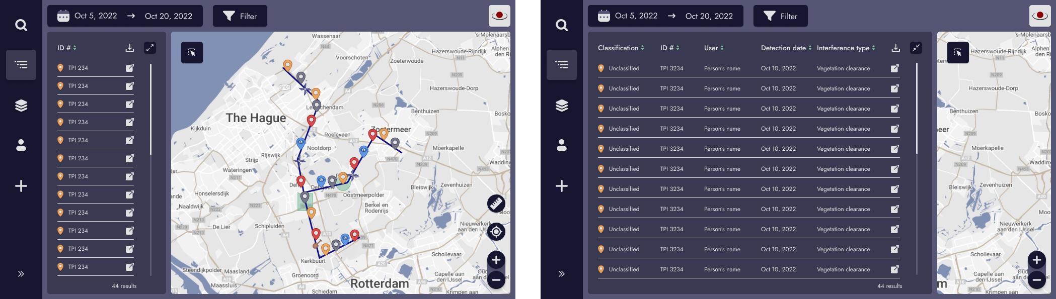
The Listview is a new feature that the customers requested. The user can see all the reports according to the chosen date range and filters. They can sort, expand, and download the list. Listview helps the users have a clear and quick overview of the possible TPIs and assign them to the field operators. Some of the customers used to make a list of the TPIs themselves which now is not necessary anymore, saving them a lot of time. A new feature called ‘select area’ has also been adapted, which allows the user to select their desired area and show the reports of that zone only.
The Optical page is one of the most important features for our customers. They can compare images of different dates to notice changes in the location and predict possible interferences. By dragging either the purple or green handle, they can change the dates, upper or lower the brightness, and use the slider between two images for comparison. Previously, the report page had an upper navigation bar, and even though it was deactivated, it still confused the users. The date range selection did not make the users recall immediately which handle responses to which photo and the dates in the corners were not very visible. Now the hierarchy of the tabs has been changed, the date range is below the images, the user can see how many photos are available, the colors of the dates correlate with the handles, and the users can expand and collapse the dates to gain more image space.
Testing
One of my favorite phases in the design process was testing. I will present a few of the more interesting findings of an important feature in the app - date range. The user is prompted to enter a date range as soon as they enter the web app to display TPIs based on a chosen date range. Firstly, due to the user's request for a list view, we tried to combine it with the date range, but after testing, the list view emerged as its own feature. Then after testing, we decided to cut out all but the most essential functions from the sidebar and move the calendar above the map to indicate that they belong together. Initially, the calendar was collapsed and the user had to tap on the start date to choose, but we ended up eliminating this unnecessary step and now the calendar opens automatically. The issue of adding 'save' and 'cancel' buttons to the previous workflow was also discussed, but testing revealed that the current flow is intuitive enough without them. Last but not least, the testing divulged that start and end dates must be distinguished by distinctive colors that are also consistent with optical images.
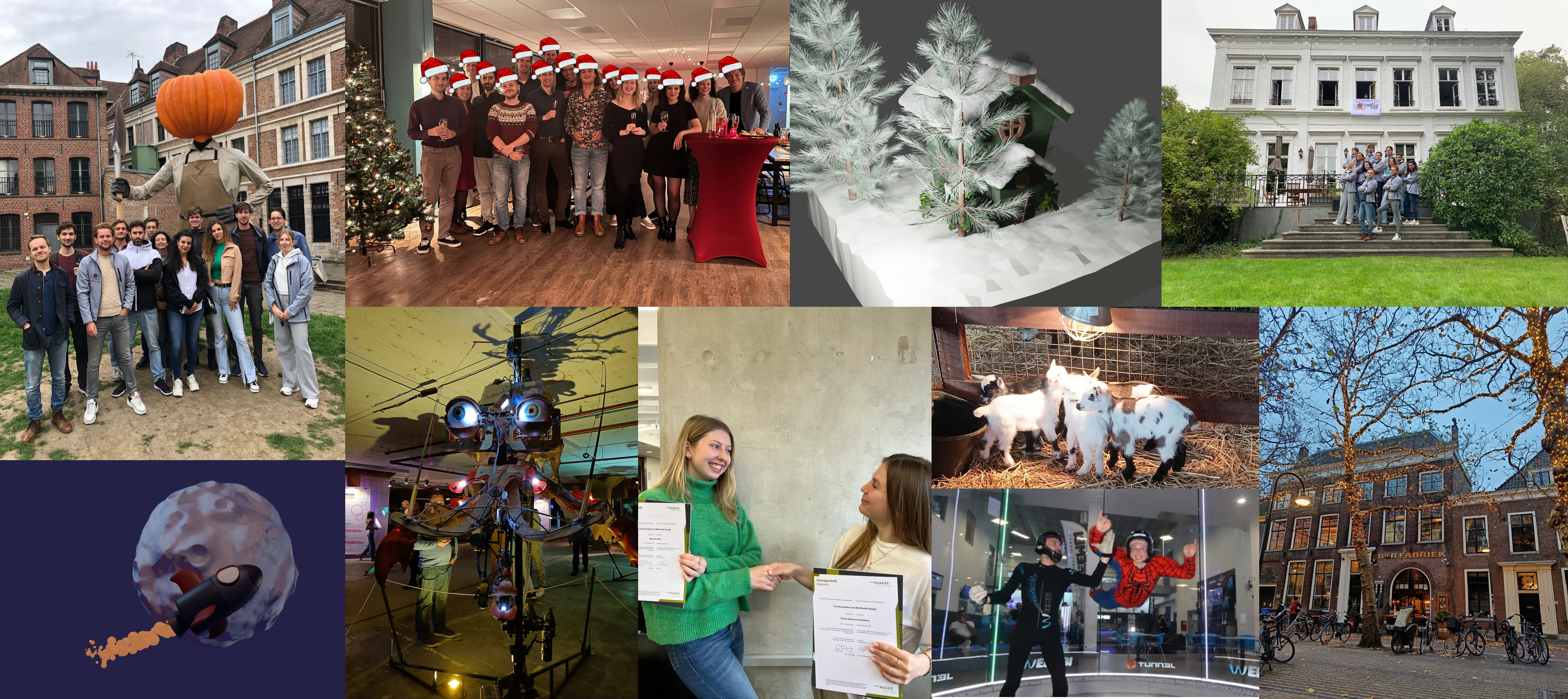
⭐ 2nd-year 1st-semester highlights
My 2nd-year 1st semester had some cool moments. First off, I started an internship at
Orbital Eye. It was awesome to work with a fantastic team on a challenging project
that pushed me out of my comfort zone. I got to learn a bunch of new stuff I'd never
touched before. + I saw so many baby goats. 🙈
We also had this company trip to Lille, and it was a blast. We
explored the city, played card games, did a murder mystery thing, and the best part?
Indoor skydiving – and yes, I rocked a Spiderman costume while doing it. That was the
cherry on top.
Then there was that classic Dutch experience when I lost my bike
at Delft station. Spent a good hour trying to track it down. Taught me to always take
a photo of my parking slot. 😄 On top of all that, I improved my 3D animation
skills and created some cool 3D paintings. Oh, and I can't forget that I snagged my
first-year propaedeutic diploma with distinction.