VoNo memo app
I was given a unique opportunity to enhance the key features of the VoNo memo app, which enables users to quickly collect and send memos. Throughout this project, I conducted extensive research to identify areas for improvement and subsequently redesigned the app's homepage. I'm happy to have been a part of this project and am excited to see the positive impact it will have on the user experience.
Objective
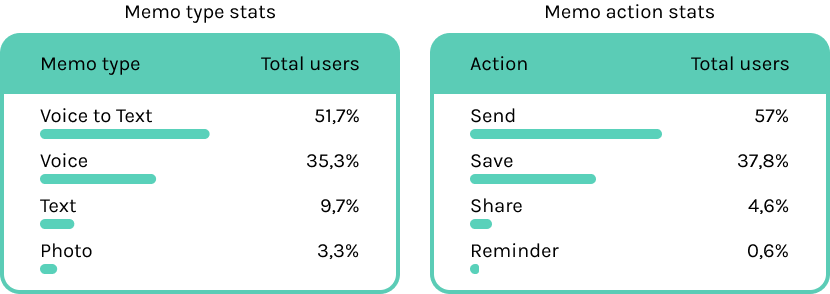
The objective of this project was to improve the user experience and user interface of the app for our client. Specifically, I was tasked with creating an updated version of the home screen that included the four 'memo' functionalities. The goal was to create an intuitive home screen that met the user's needs. Throughout the project, the client was open to removing or adding new features to the home screen as long as it improved the user experience. The user statistics attached below will show the most used features.
Getting to know the app
To begin my process, I familiarized myself with the VoNo app by exploring its
functions. I purposely approached the app as a new user with no prior knowledge to
assess its ease of use. I took notes on what was clear and what could use improvement,
and then visited the VoNo website for a more comprehensive understanding of the
application's purpose. Next, I wanted to gain insights into the app's customer group,
so I combed through Google Play reviews to gather user feedback. Before moving on to
prototyping, I wanted to ensure that my own biases didn't influence the improvements I
would make, so I enlisted the help of my peers to test the app and provide their
feedback. Finally, after analyzing the results of my testing, I compiled a list of
recommended improvements to the app.
List of improvements
UI: Overall, the app looks nice and functions well. However, to enhance its
appearance, I suggest making the icons more consistent. Additionally, while I work to
meet the client's preferences, I believe it's important to maintain good design
principles.
UX: From a user experience perspective, I have several
suggestions for improvement:
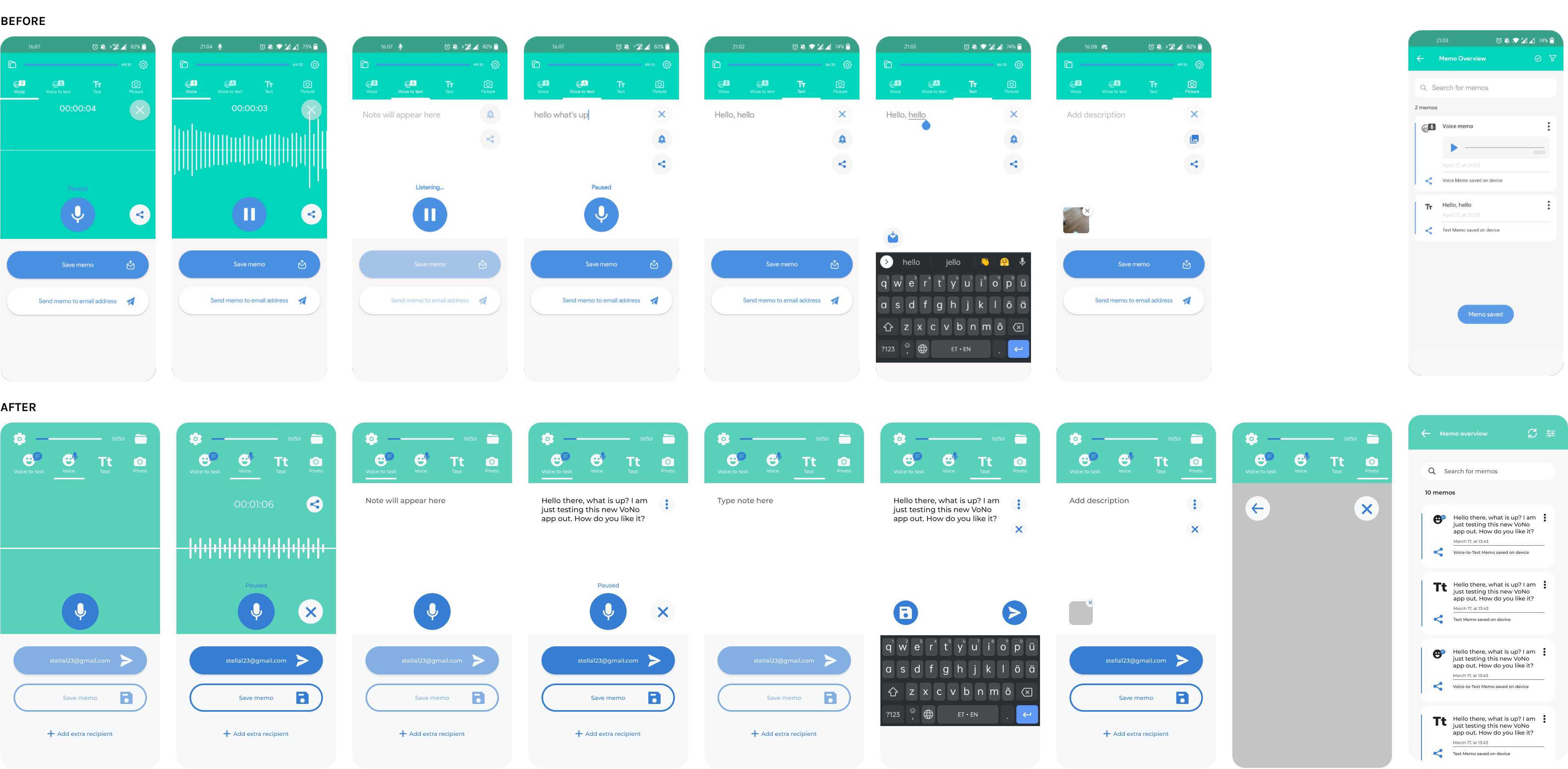
- Currently, the recording starts automatically when the app is opened. While this may be useful in some scenarios, such as when driving, it can be inconvenient and disruptive in other situations. (Sidenote: the driver should not use the phone anyways when driving). Users should be able to control when recording starts and stops more easily. During my research, I found out that this functionality is not convenient and is disturbing since the user would have to tap on the Discard button (+ discard memo) to make it stop.
- According to the information I received about VoNo, the users use mostly the voice-to-text function, so it should be first on the list. As the percentage shows, “reminder” and “share” are not as popular, so these should either be removed (and used only on the “memo overview” page) or hidden. The user shouldn’t be distracted by those features since the main point of this application is to send a memo fast to yourself or someone else.
- I am interested to know what the blue line on top of the screen is for, and for what stands the 50/10 number. I understand that the first number decreases because the user has 50 memos without the Pro version, but what does the 10 stand for? And I guess the blue bar should also increase/decrease depending on the number of memos left. (This started working after I had only 10 memos left).
- When first registering the account, maybe it would be nice to get a pop-up indicating that the user has 50 free memos and lead them to the page where they get more information about it. 5. I like that there is an option to change the order of the “send” and “save” buttons, but they could have a different look, so the user could recognize the correct button immediately without thinking and reading.
- On the “voice” page, the share button does not function when nothing is recorded. This could be removed and have it only on the page where the recording has stopped, would be enough.
- It would be more coinvent to have the “memo overview” (or the “folder”) icon on the right side of the screen. Firstly, for right-handed people (90% of the world's population) it is easier to reach it, but also the 50/10 would be more understandable and indicated clearly in the memos.
- When first opening the app, there is a “Get started” button and usually the user can enter their information. Here, however, this step is skipped, and the user is immediately in the app. Does this mean, that after I enter my email as a recipient I am automatically registered/logged in and in the future can sign in with my Google, etc. account? In that case, the “email and password” login does not have a function.
- On the login page, I cannot go back to the “Get started” page if I accidentally have tapped on the "login" button as a first-time user. I would have to uninstall and then install the app again.
- It would be nice to ask the user if they want their first recipient’s email address to be the one, they registered with. Usually, the account you register is the primary one anyways, and this would make the process faster for the user, instead of double asking for their email.
Prototyping
After identifying the app's functions and core needs for the home page, I began
prototyping. To ensure consistency throughout the app, I created a style guide and
designed new icons, some of which I downloaded and others I made myself. I then worked
through my list of improvements, taking care to center and size everything perfectly
since I'm very detail-oriented. One challenge I faced was deciding whether to leave
the 'reminder' and 'share' functions on the home screen, as their usage rates are
relatively low (4.6% and 0.6%, respectively). However, for the sake of older customers
who may rely on these features, I ultimately decided to keep them accessible. I
started by designing a new navbar that looks similar to the old version but with some
improvements, such as the new icons and different orders. Then, I moved on to the
enabled and disabled 'send' and 'save' buttons and worked to optimize the user
experience. I followed this process for every page, including creating pop-up pages
like 'add extra recipient' and 'error'.
The changes I made:
- New icons – consistency throughout the app.
- The “folder/memo overview” and “settings” switched places. More convenient for right-handed users, “settings” are not used as often.
- Numbers above (10/50) show that the user has used 10 out of 50 memos, and the bar will increase according to that.
- Recording doesn’t start automatically anymore, instead the user needs to start it themselves.
- New look to “save” and “send” buttons, so the user can tap on them without further thinking.
- The “discard/cancel” button has been moved down, so the user could easily discard the recording, or delete the whole text when typing.
- I also wanted to delete the calendar and/or share button at least from the main page, so they can do it in the memo overview anyways.
- I decided to leave the “reminder” and “share” options on the home page, but I placed them under “options”.
- The “photo” page has now an option to view the photo taken before sending or saving it. It is always good to have the option to check what you are sending, to be sure it’s not blurry, for example.
Check out the app
VoNo memo Figma link