GoDutch online grocery shopping redesign
During this project for 'Interaction Design 2' course, my team of 2 learned user interaction design techniques to create the (information) structure of an interactive digital product.
Problem: Enhancing Dutch store website experience
The website is lacking structure and emotion. Information is cluttered creating a lot of visual noise and distraction for the user. It also does not give a visual and conceptual feeling of a Dutch store, which avoids the user creating emotional engagement with the store.
Solution
Making the website effective and structured by creating a look that is visually pleasing and clutter-free. The new design will be more engaging to the users which makes them want to come back to the site and order more of their favorite foods from their culture. The redesign should give the users feedback on their actions and be user-friendly without overwhelming the user.
Analysis
As a first step, we had to analyze the persona, and the current website by performing an extensive expert review and presenting our findings in a convincing and coherent conclusion.
Insights from persona
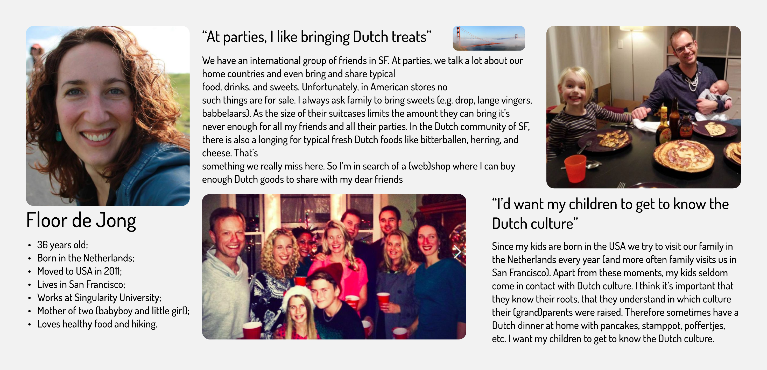
#1.1 Dutch expats feel the need to instill a love and understanding of Dutch
culture in their children born and living outside the Netherlands.
#1.2 Typical Dutch food is a reflection of the culture and traditions of the
Netherlands, respectively, through food, in particular, people experience a connection
with their homeland and roots.
#1.3 In the intercultural environment, Dutch expats introduce their country and
traditions by preparing traditional food for their family and friends.
#1.4 Сhildren of Dutch expats in the United States (San Francisco) seldom come
in contact with the culture of their parents.
#1.5 The lack of fresh Dutch products on the US market limits expats' culinary
options and they cannot cook their favorite meals.

Expert review insights
#2.1 The overview of the products is overloaded and requires much time and
effort to find and/or recognize the needed item.
#2.2 The website's homepage has too much unnecessary information that creates
visual noise and distraction for the user.
#2.3 The website has no visual and conceptual feeling of a Dutch store,
therefore users don't feel emotional engagement.
#2.4 The webshop doesn't make use of visual hints (icons and colors) which
makes it hard to navigate through the website.
#2.5 Registering a new account has overwhelmingly much information which can
scare away a potential customer.
Requirements
Secondly, we had to link the requirements clearly to the insights we presented in the analysis.
- Make the homepage effective and structured. #2.1
- Make the homepage look visually pleasing and clutter-free. #2.2
- Add more icons and different colored buttons to the website to help the user recognize the correct action. #2.4
- Make the website more emotionally engaging to their customers. #1.1 #1.2
- Give users feedback on their actions. #2.2
- Create a category with kids’ products. #1.4
Redesign
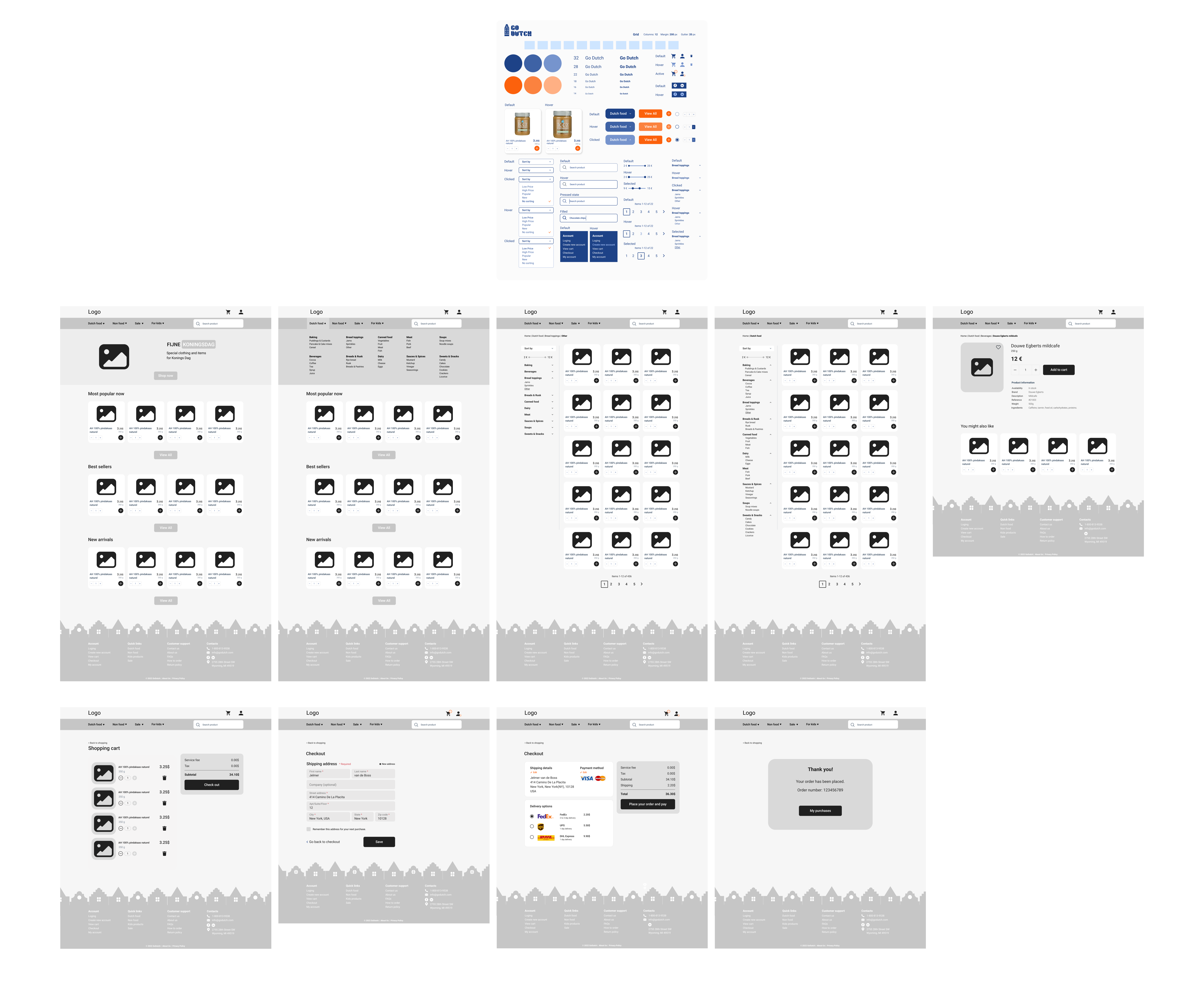
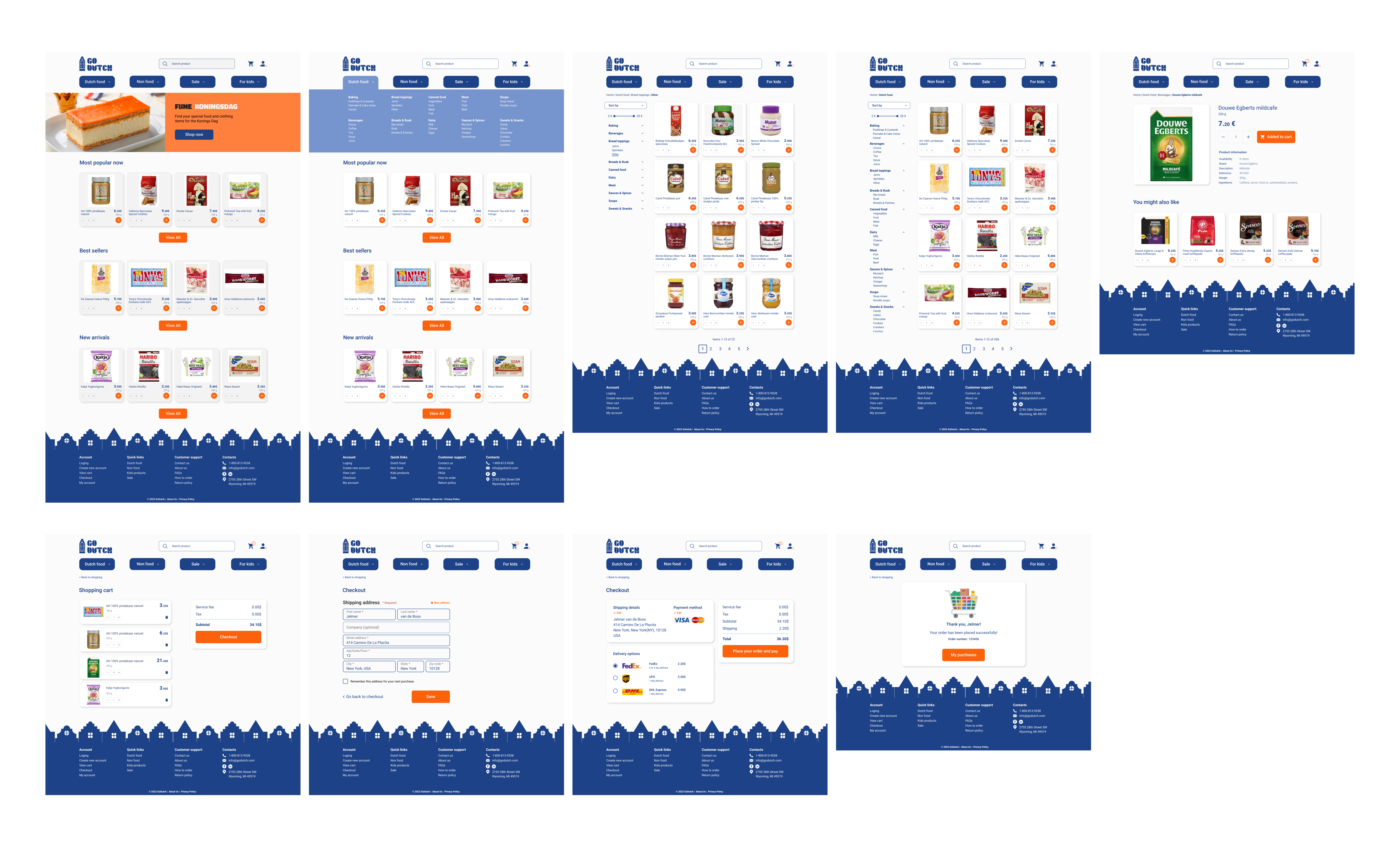
The redesign of the grocery store website began with a style tile and the creation of initial wireframes.

This is followed by visual interface design and description of interactive elements, high fidelity prototype and the motivation of design choices.

